

The Reddit post
As some of you might now, there was recently a Reddit post on r/FourSouls pointing out how their GFuel promo card (Four Souls v2) was a lot different from their other (Four Souls v1) card.
Here is the picture that was shared:

This is nothing new for us, as we already knew that v2 cards have a different hue/saturation when compared to "old" Four Souls cards.
This was also further confirmed by u/Chaos1917 (Maestro Media employee), which commented:

However, we took this event as an opportunity to have an even closer look at the GFuel cards.
Our v2 cards and GFuel compared
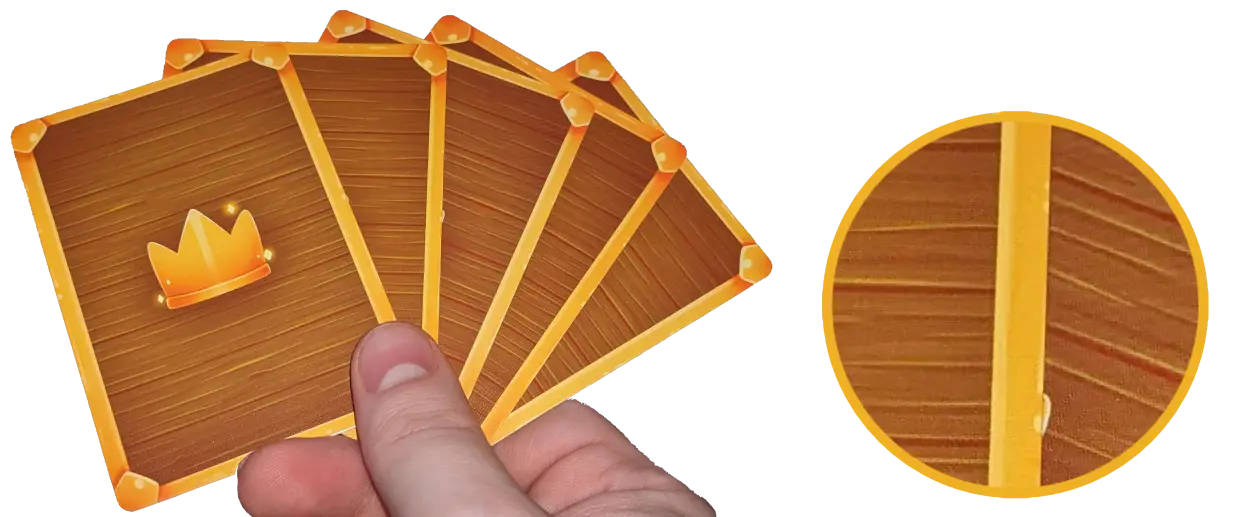
At first glance, we thought that our v2 cards and the GFuel cards were completely identical. But after inspecting them closely, we found out that there is a very marginal difference in the horizontal lines of the wooden pattern of the treasure cards.
Depending on your screen, if you look at the close-up circle, you should more or less be able to notice a slight color difference between those lines.
At this point we are trying to understand which of the two is closer to how the kickstarter cards will look like, which is why we have put our third order temporarily on hold.