
Design a Custom Card
Everything you need to go from a blank canvas to a print-ready custom card — templates, card layout rules, and the right software for your skill level.
The community maintains official-style card templates in PSD format, along with the fonts used in the original game. Download them before you start — they include all card types (Treasure, Monster, Item, Soul) and the correct bleed margins for print.
Any of these will produce a printable result. Pick based on what you already have and your comfort level.
Adobe Photoshop / Illustrator
ProfessionalIndustry standard with the widest template compatibility. The only option that supports our calibrated color correction for MPC.Subscription (~$60/mo)Affinity
IntermediateNear-identical features to Adobe. Excellent PSD and AI template support.FreeGIMP / Inkscape
IntermediateOpen-source and capable of print-quality results. Steeper learning curve and limited PSD template compatibility.FreeEach card is built from five stacked layers. Hover a layer to isolate it. Click to collapse.

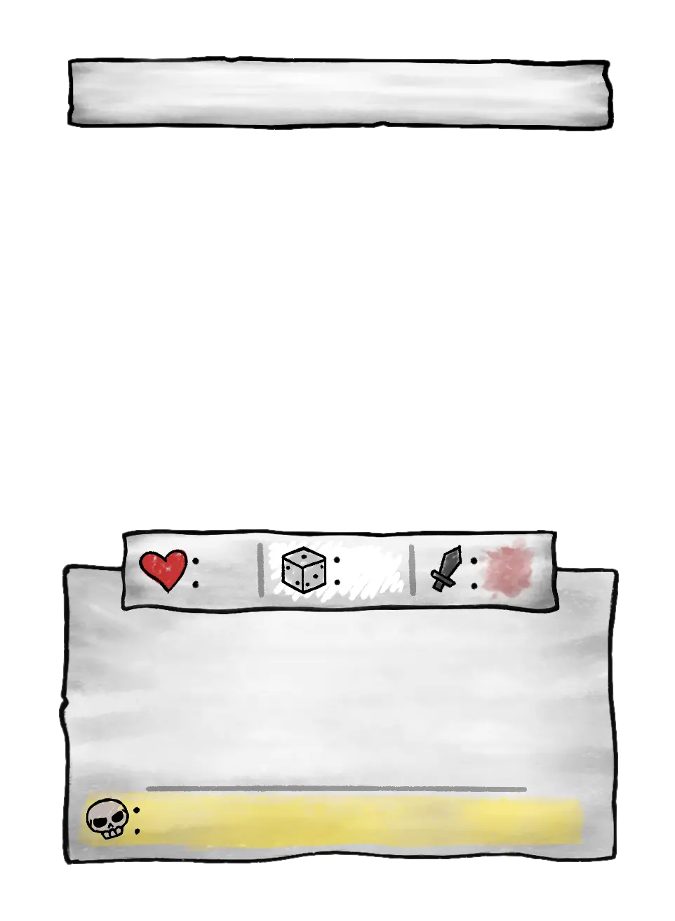


01 —Background
Card frame, color zones & bleed margins02 —Artwork
Your illustration fills the art zone03 —Paper box
Stat and effect text areas04 —Typography
Card name, flavour text & effect copy05 —Icons
Set symbol and other iconsDetails first-timers most often miss. Get these right and your card will read as intentional.
Use the right font for the right zone
Font_soulsV3_Title.otf for card names (always ALL CAPS) and Font_soulsV3_Body.otf for effect and flavour text. Using the body font for the title (or vice versa) is the most common first-attempt tell.Text is (almost) always centered
Effect line opacity: 30% and 20%
Don't shrink below 40px
Keep stats in their template zones
Design your own set icon
Hex values used in the official cards. Click any value to copy.
That covers the design side. Here's where to go next.
Made something you're proud of? Share your booster pack with the community →